← All Work
09 / 09

Mahindra Car&Bike

Rebranding Mahindra First Choice into car&bike — a consumer-facing marketplace for pre-owned cars.

Elephant Design, Pune

🏆 e4m India Design Excellence Awards — Gold, Best Design for Rebranding
Role
Identity Design + Visual System Guidelines + Retail Design
Scale
450+ cities, 1,100+ stores, 2M+ customers

Task at hand

Mahindra First Choice was known as a trusted, editorial voice on used cars — informative, but not somewhere you'd actually go to buy one. The job was to shift that perception into a real consumer-facing marketplace, car&bike, with one identity system that works everywhere from a mobile app to a showroom facade — without losing the editorial trust that got it there.

Challenge

Balancing commercial car-selling with the brand's trusted editorial objectivity, without one undermining the other. Building a system scalable enough to bridge mobile UI, signage, retail interiors and regional languages. And standing out against aggressive, digital-native used-car aggregators without losing the brand's original credibility.
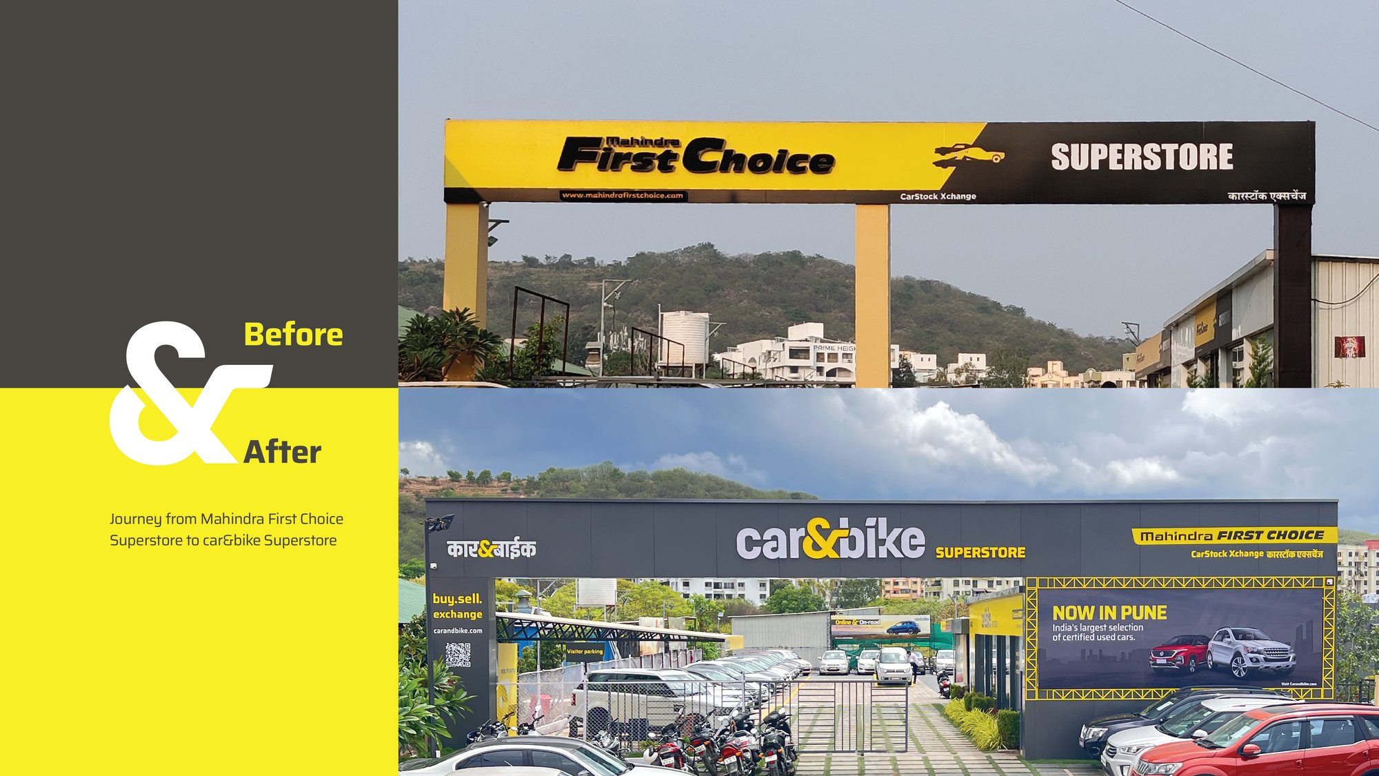
Before and after: Mahindra First Choice Superstore rebranded to car&bike Superstore

The journey from Mahindra First Choice Superstore to car&bike Superstore.

Brand identity — animated.
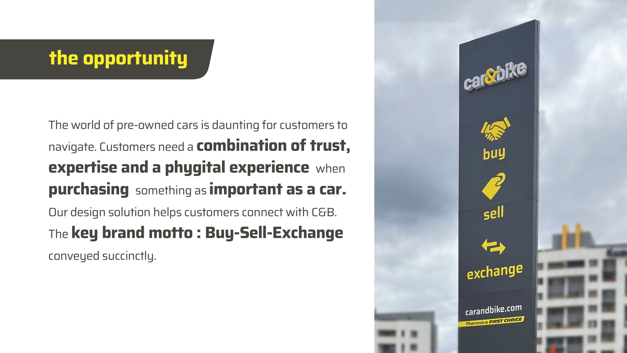
car&bike wayfinding tower signage: buy, sell, exchange
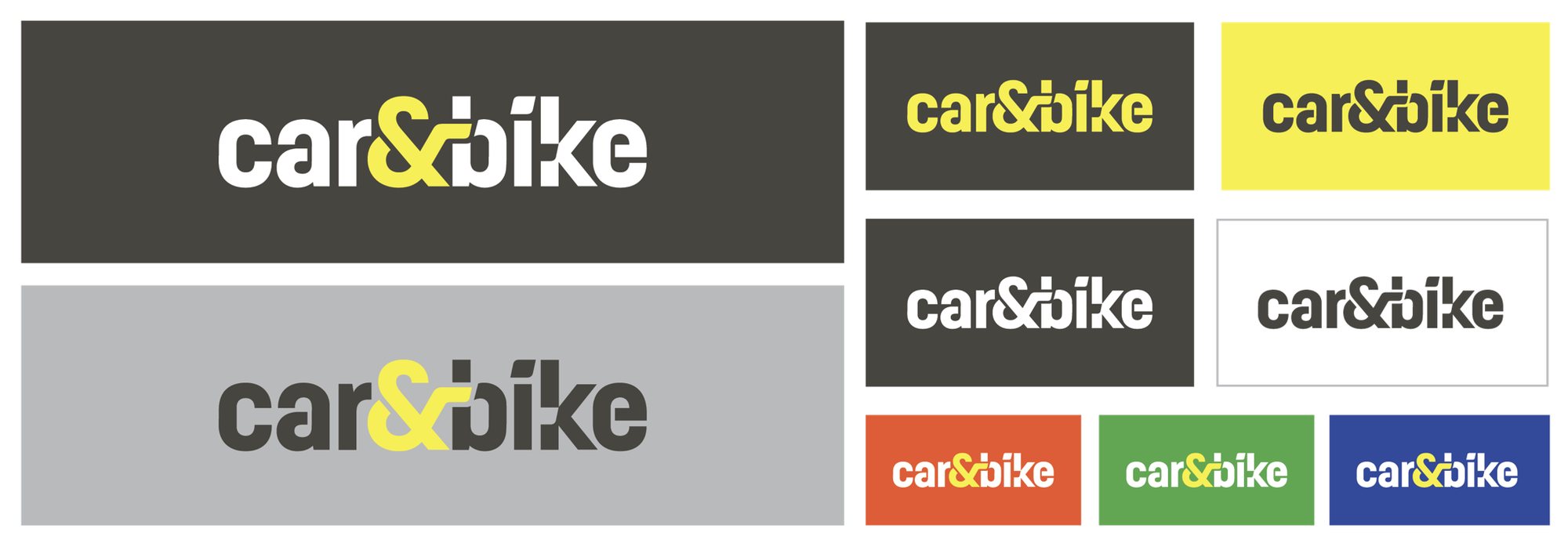
car&bike logo color and background variations
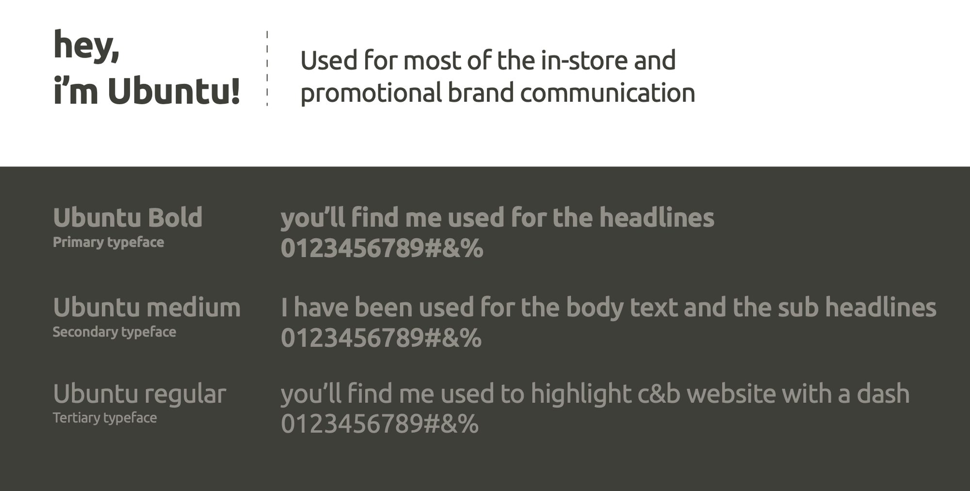
car&bike typography system specimen
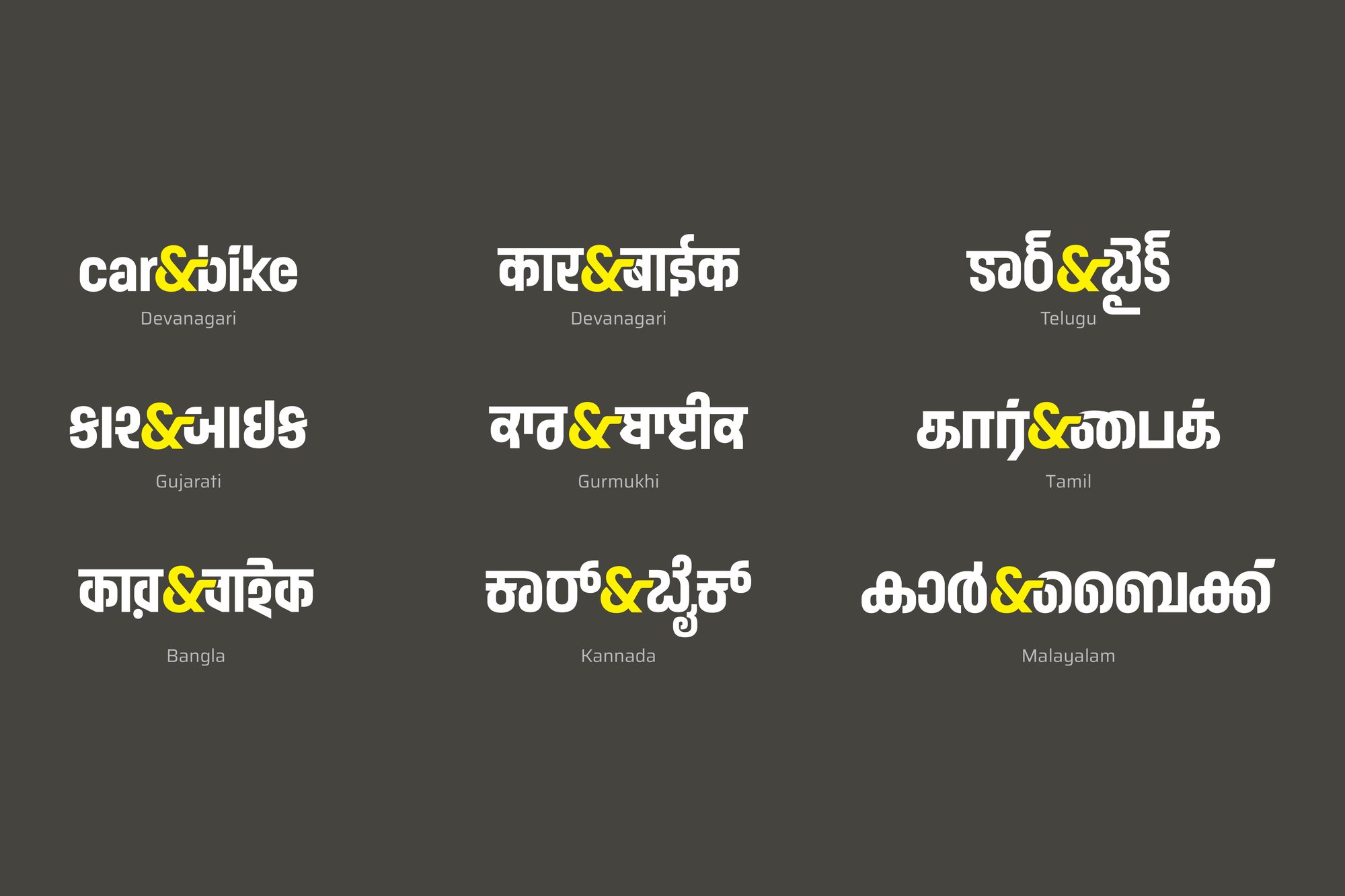
car&bike logo lockup across nine Indian scripts

The logo, rebuilt across nine regional scripts.
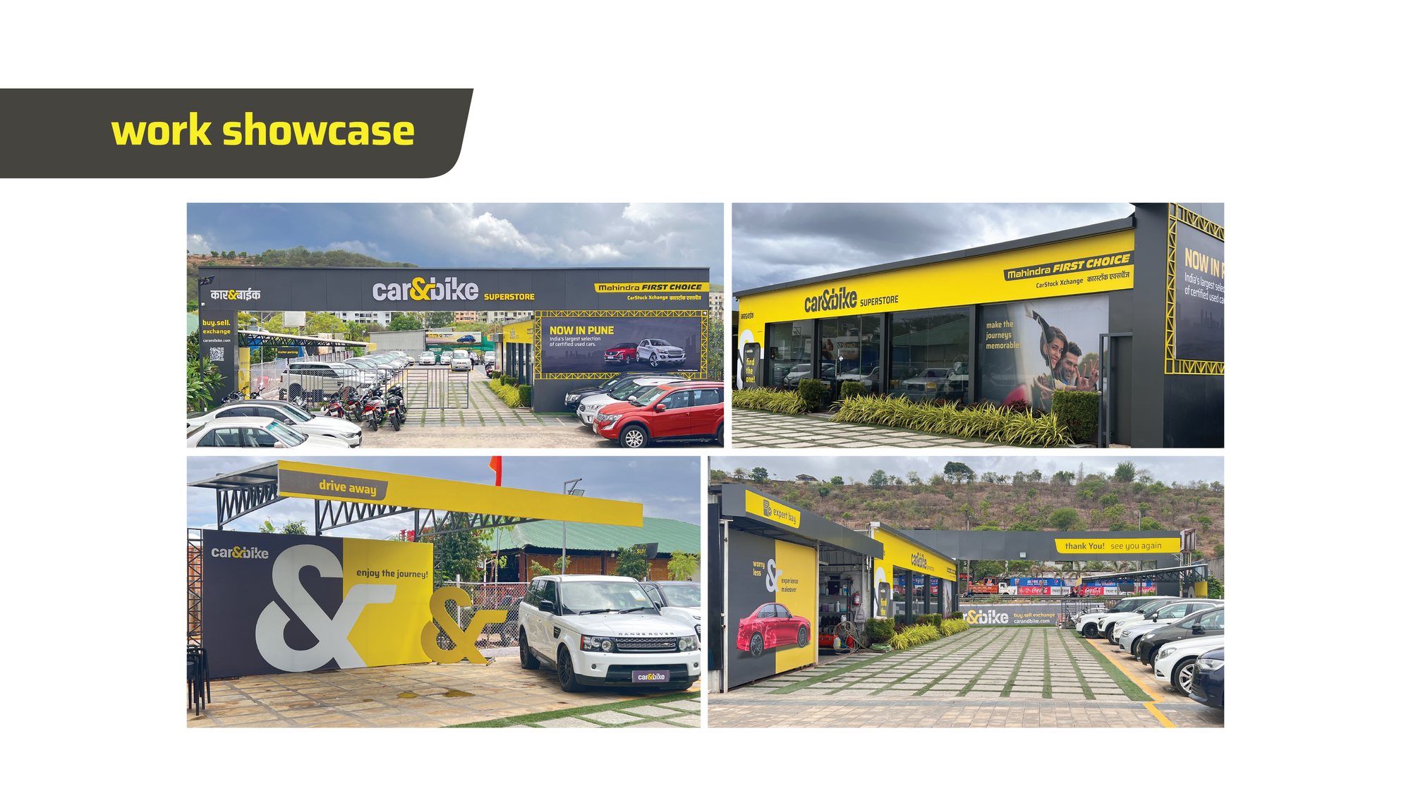
Real car&bike superstore photography — storefront, signage and forecourt
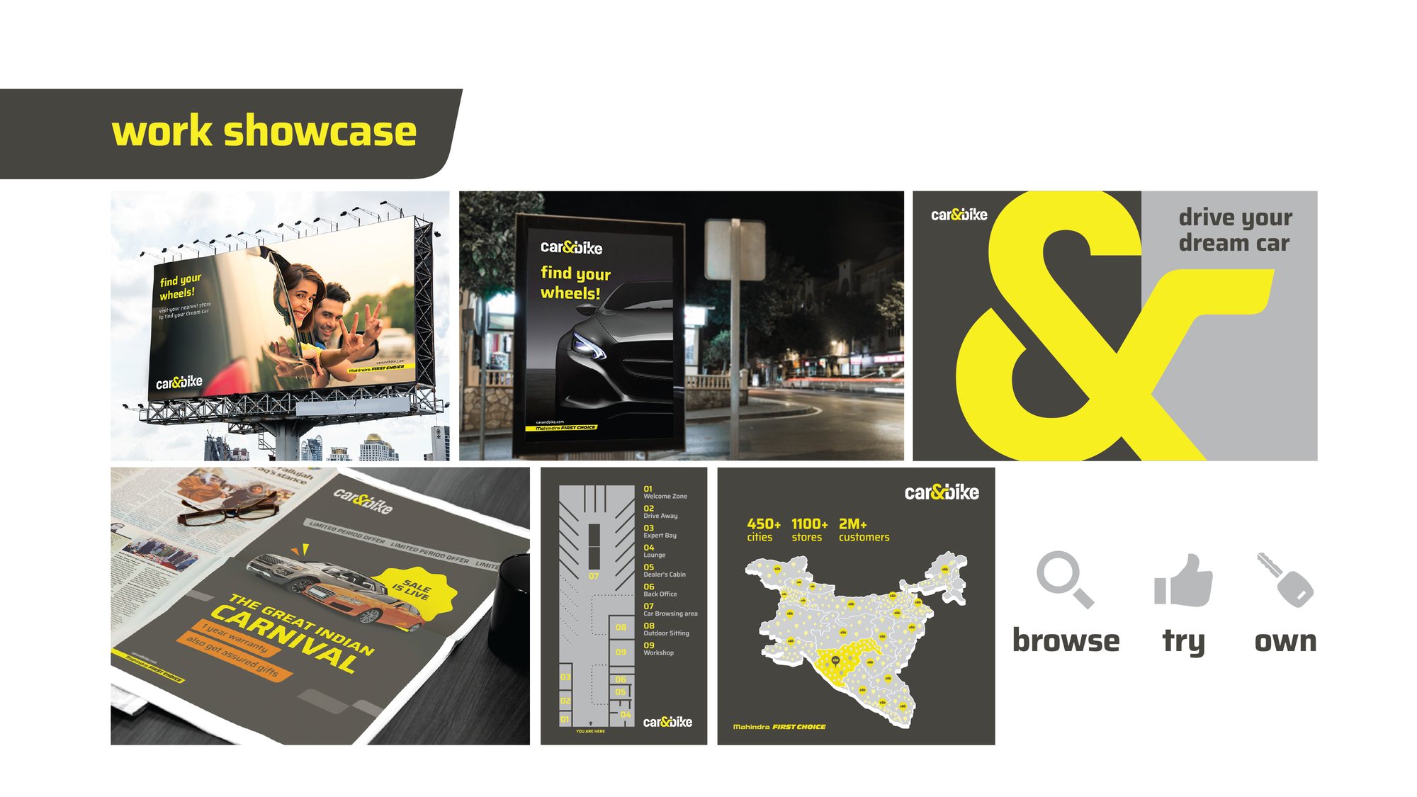
car&bike billboard, bus-stop poster, print ad and store wayfinding map

Billboards, print, in-store wayfinding and the national store map.

09 / 09 the system

Design System

The name already had the idea built in — "car&bike" gave us the ampersand as the core of the mark.

The ampersand as identity Built the rebrand around the concept of matchmaking — the "&" in car&bike became the core of the logo, standing in for the brand's role connecting buyers and sellers.
Evolution, not reinvention The shift assures customers of Mahindra's legacy underneath it — retaining brand equity while modernizing the expression.
Buy, sell, exchange The brand motto conveyed succinctly across every touchpoint — wayfinding towers, signage, and retail interiors all lead with the same three words.
Bilingual, nine scripts deep Worked with a type designer to rebuild the logo lockup across nine regional scripts, so it reads consistently from a metro showroom to a small-town superstore.
One system, every touchpoint Comprehensive guidelines covering app UI, signage, showroom interiors, vehicles and print — built to scale across 1,100+ stores in 450+ cities.