← All Work
03 / 07

WickedGud

Name, identity and packaging built from zero for a new nourishment-first snack brand.

Elephant Design, Pune

🏆 e4m India Design Awards — Gold, Branding for Startups
Role
Identity + Packaging design + System design
Category
Pasta, noodles, cup noodles, popped chips

Task at hand

Building a disrupter brand from zero — from developing the name, brand persona, and visual identity, to packaging architecture for a new-age food brand offering 100% nourishment (made from chickpeas, red lentils, and brown rice) across pastas, instant noodles, cup noodles (Indian and Korean flavours) and popped chips.

Challenge

Healthy food in India carries a heavy stigma, perceived as bland and boring, while "junk food" is exciting and craveable. Navigating the constant tug-of-war between Gen-Z/kids who drive cravings for junk food and mothers who act as strict health gatekeepers, without alienating either group.
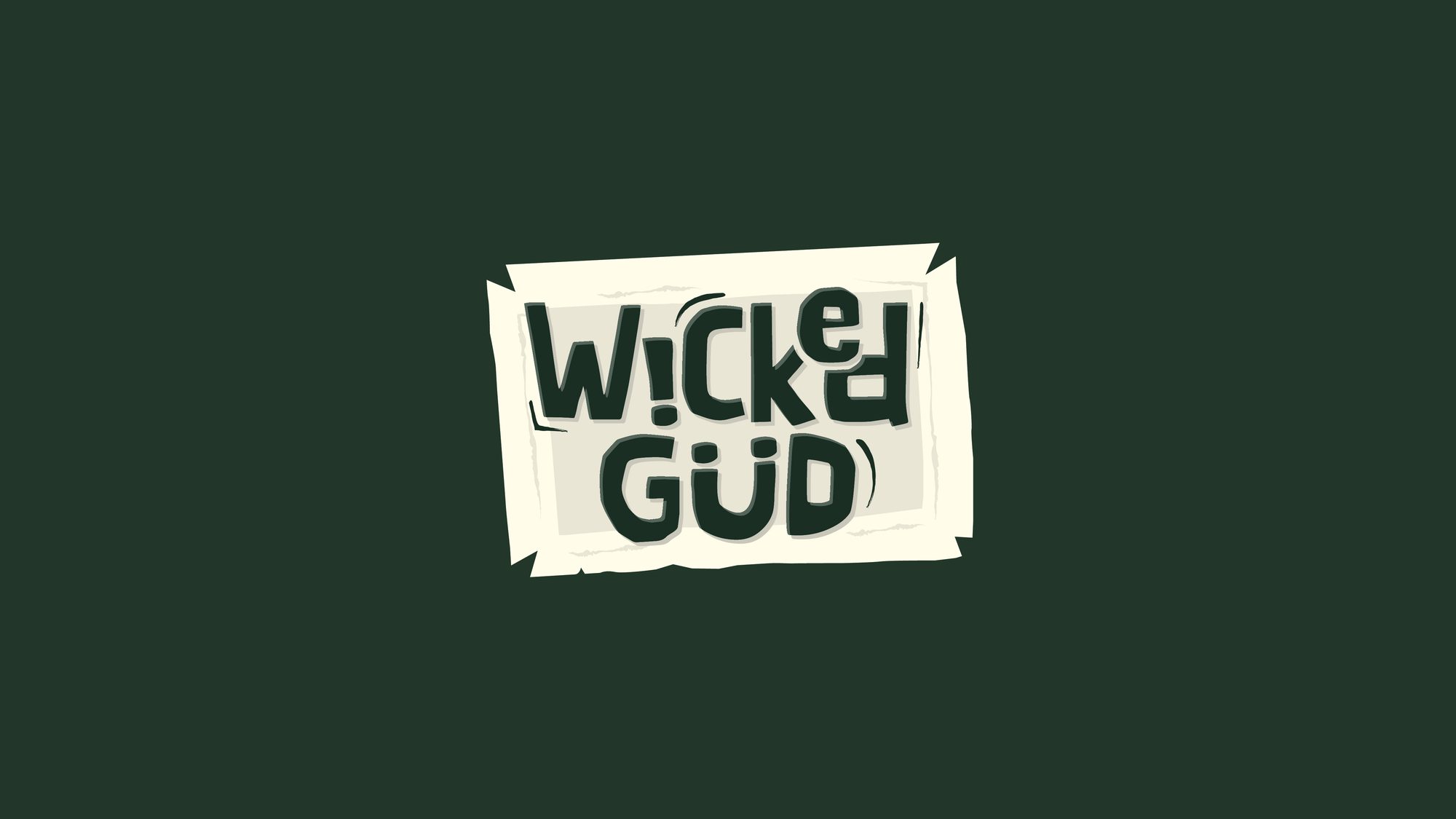
WickedGud logo identity
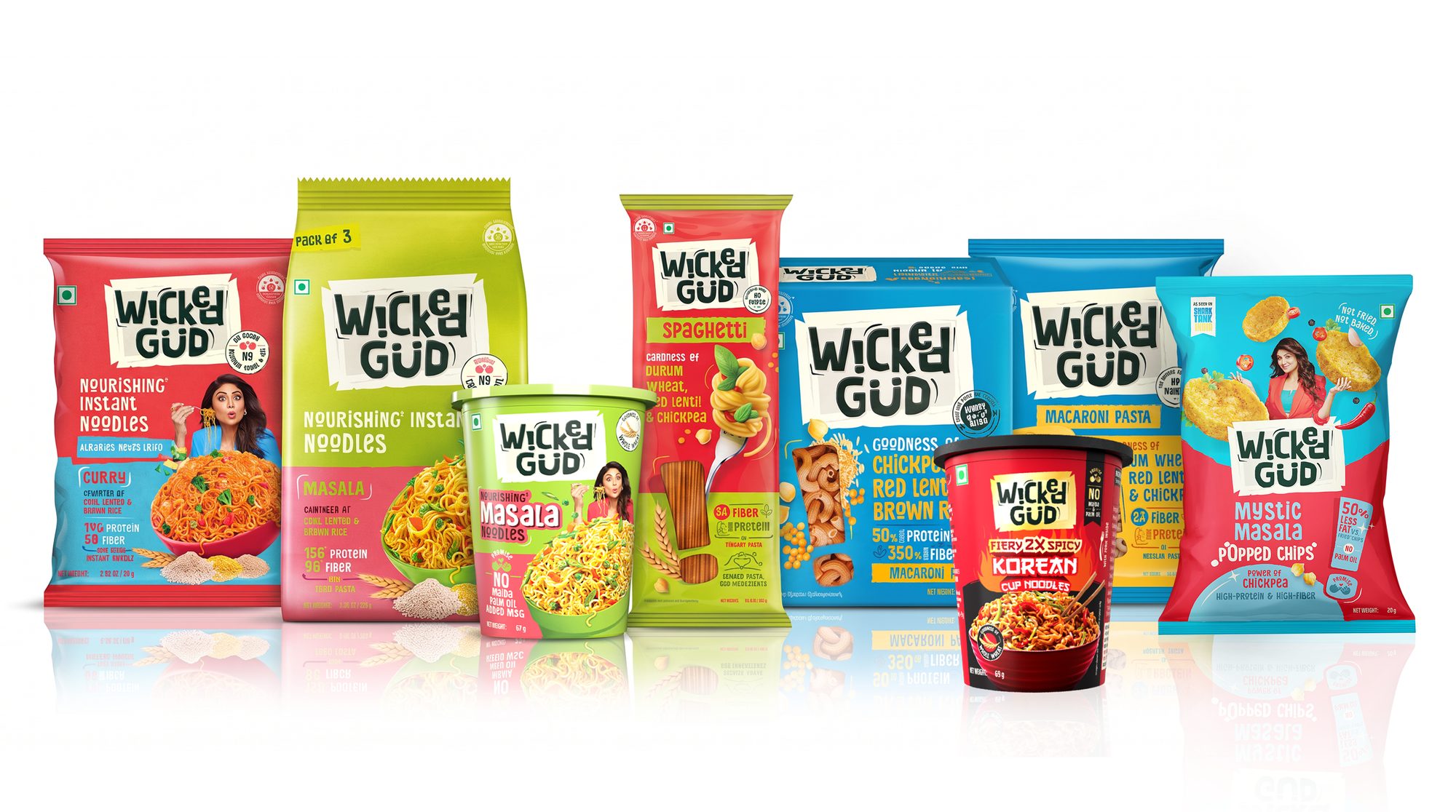
WickedGud full range shot
WickedGud two-fronts packaging
WickedGud packaging system detail

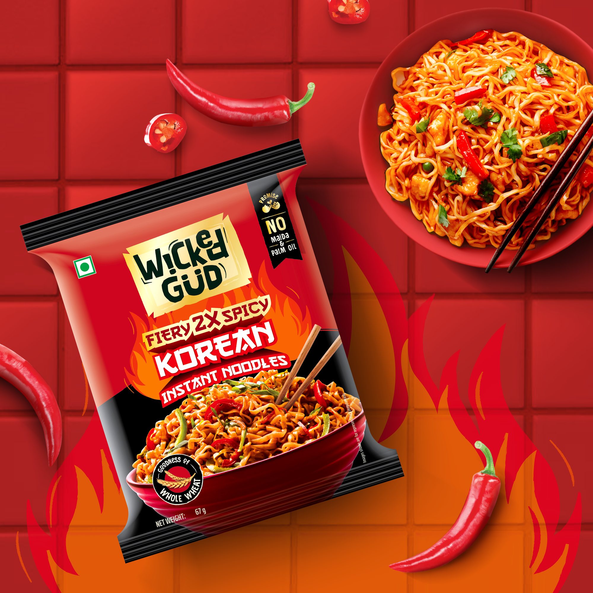
Korean instant noodles extension — animated pack reveal.
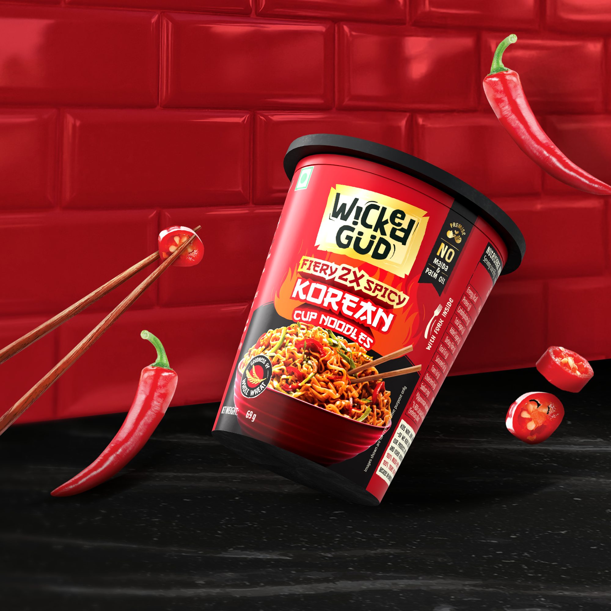
WickedGud Korean noodles variant
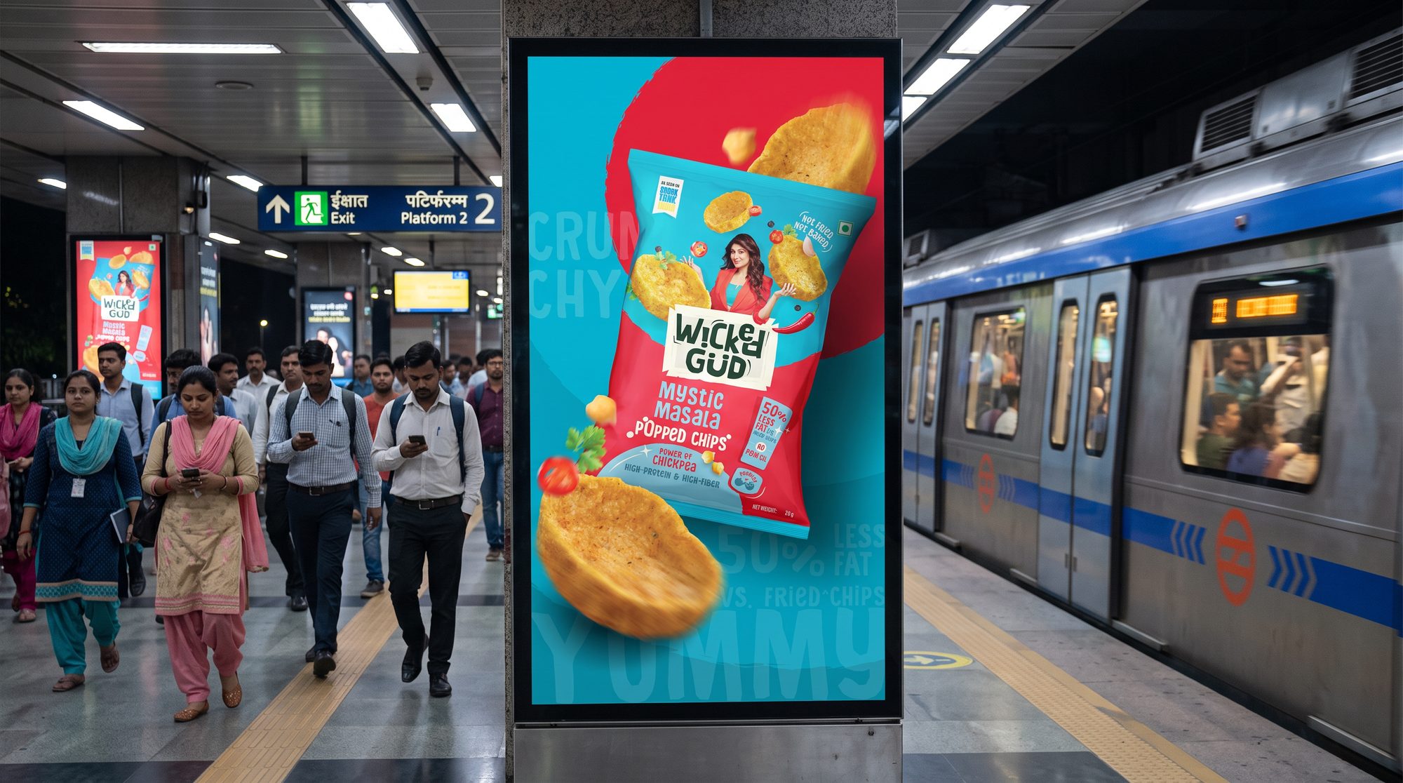
WickedGud popped chips retail mockup
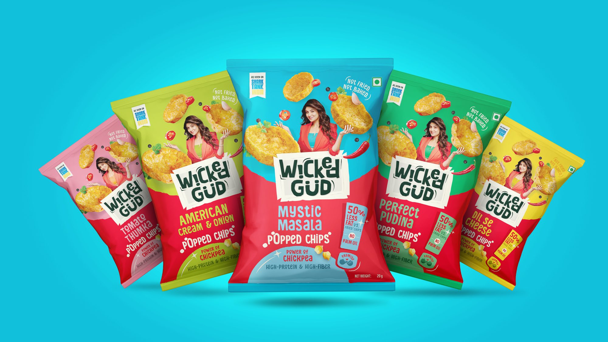
WickedGud popped chips packaging
03 / 07 the system

Design System

The hard part was getting "good for you" and "tastes like junk food" to sit on the same pack without either one feeling like a lie.

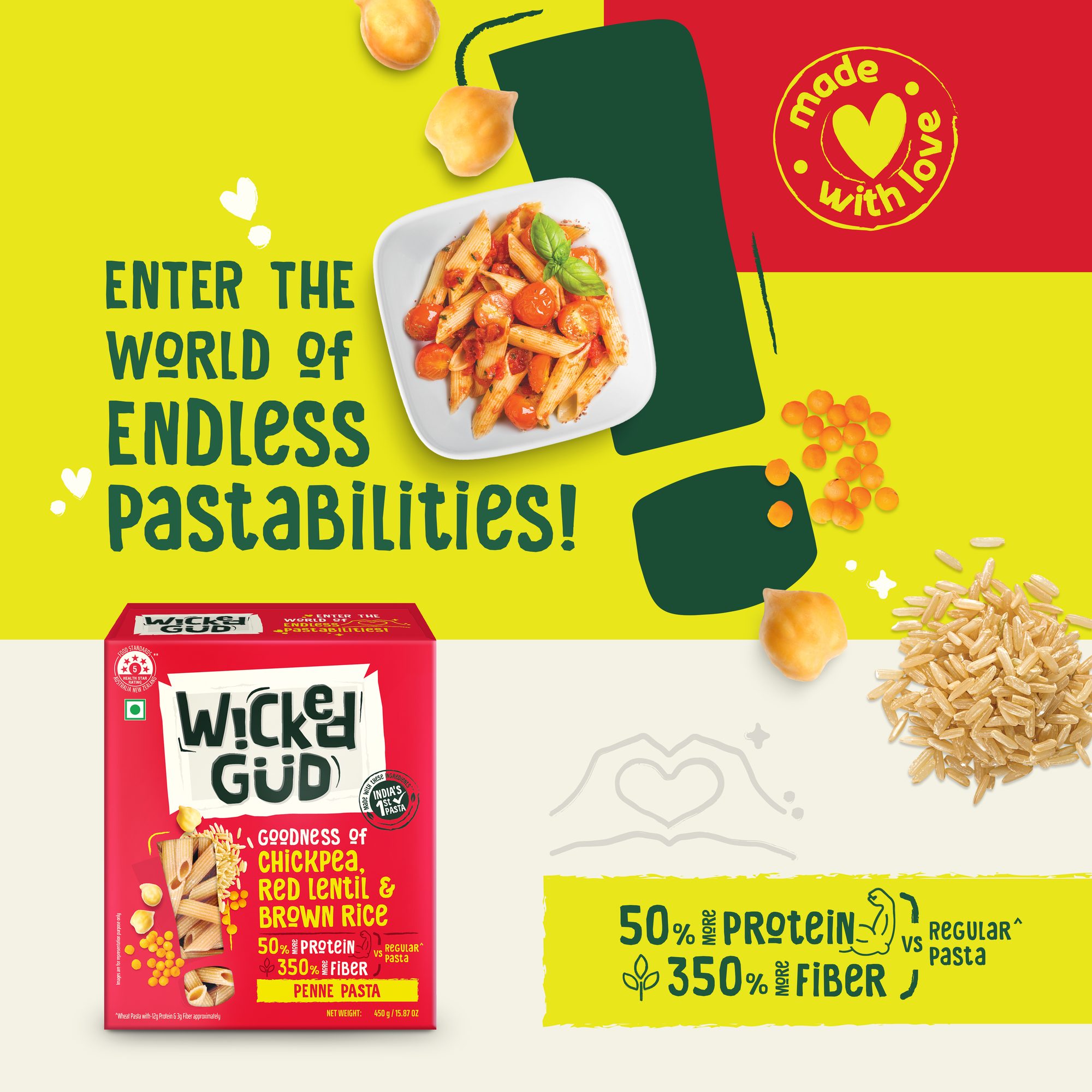
Duality in name & identity Built the strategy around a paradoxical oxymoron: Wicked (fun, indulgent, craveable taste) + Gud (honest, clean, dal-chawal-chana nutrition).
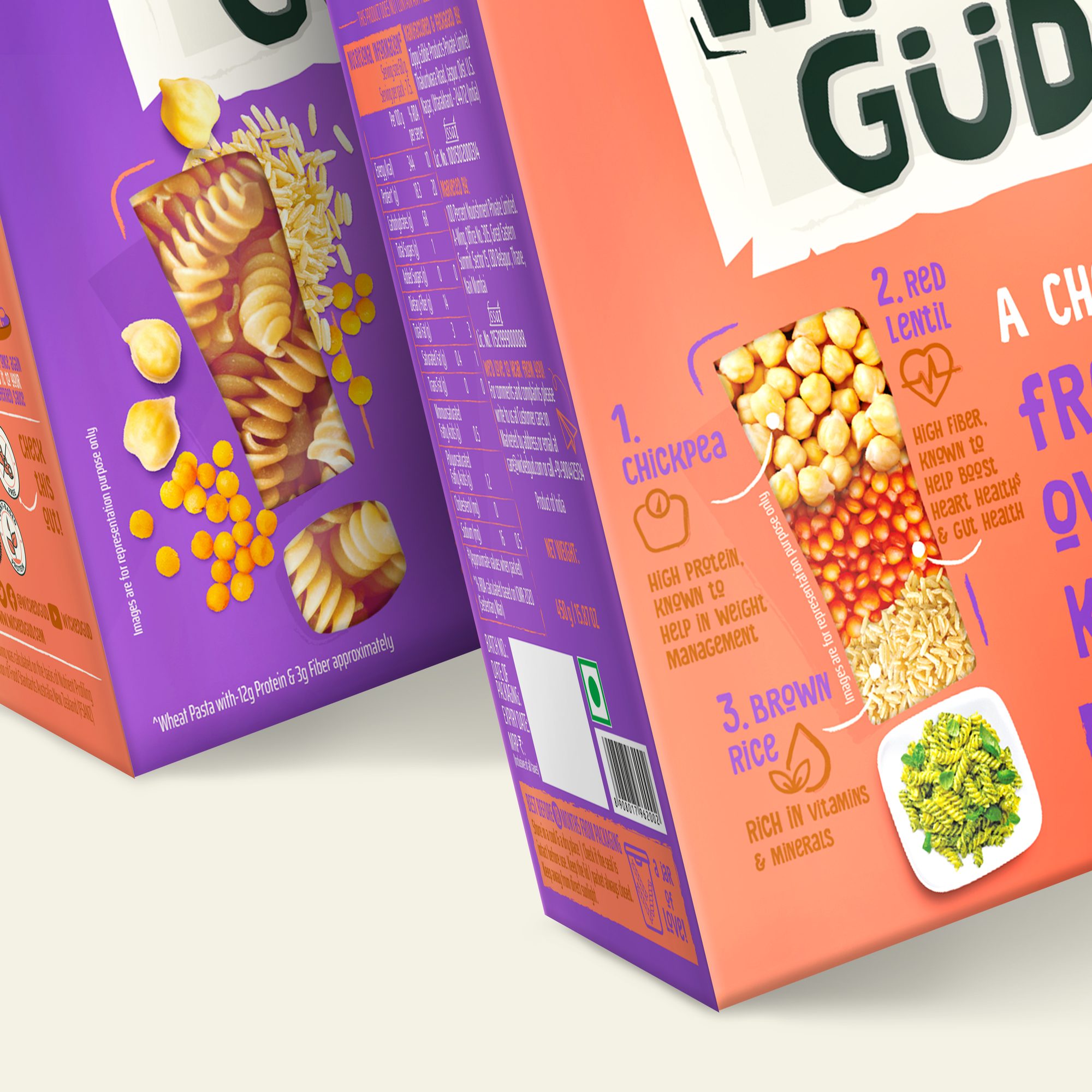
The "two-fronts" packaging innovation Eliminated the traditional boring back-of-pack. One face represents "Wicked" (emotional hook, fun messaging); the opposite face represents "Gud" (transparent nutrient breakdown). Mandatory legal text migrated cleanly to the side panels.
Neon highlighter palette High-voltage, rare neon color blocking breaks out of earthy "green wellness aisle" tropes and subliminally signals highlighted transparency.
Exclamation mark as device Borrowed from the identity, the exclamation mark became a strong hook on-pack to highlight health story, food imagery, and a unit of promise.
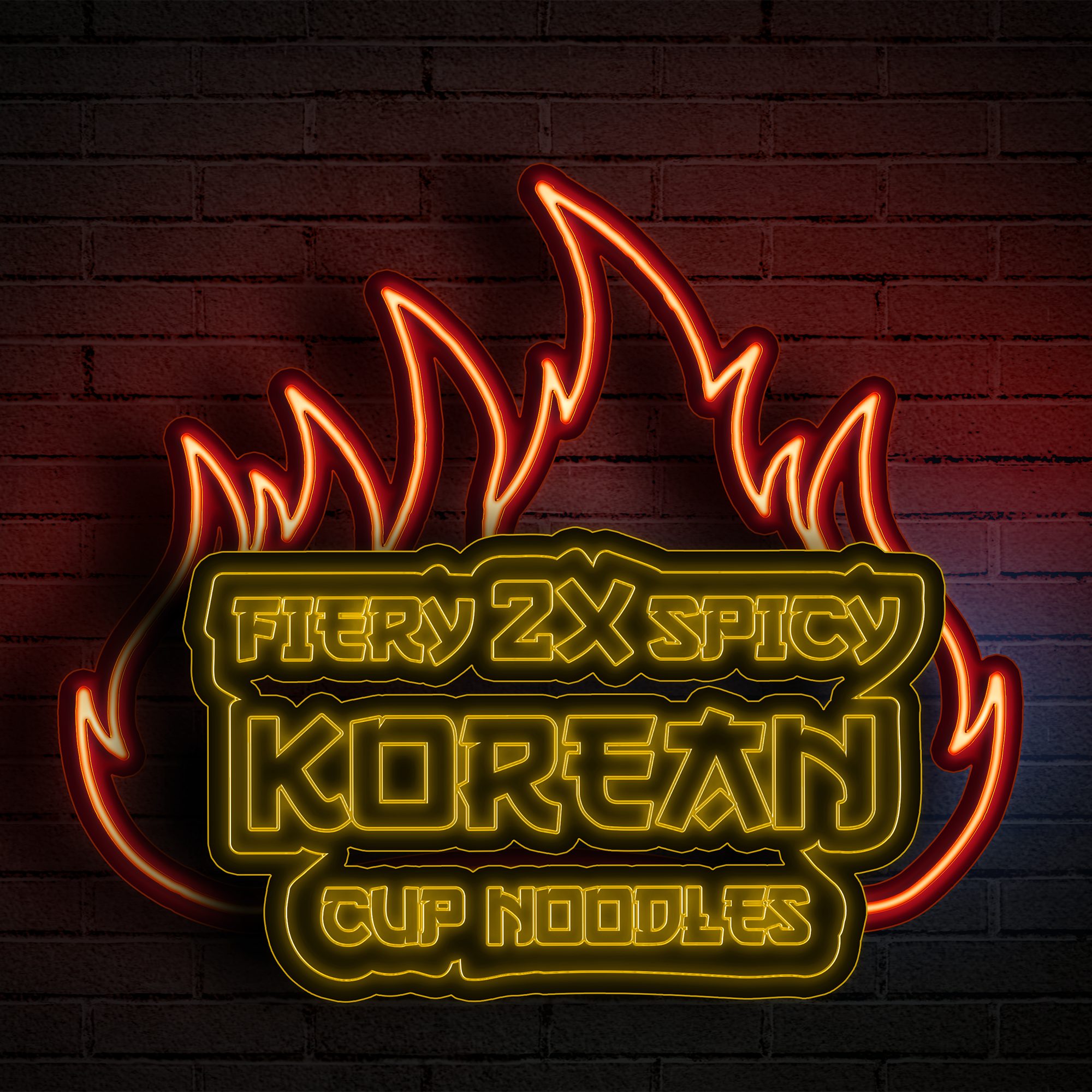
Korean noodles extension Bold Korean visual language and gold metallic accents create strong shelf presence, reimagined through WickedGud's playful identity while staying category-authentic.
Popped chips extension A brand-first identity with a magician endorser balancing health with great taste — bright red establishes category cue, with contrasting variant colours for range differentiation.